Apptio One unifies financial & operational data into a unified model. The tool enables organisations to answer the most critical questions regarding investments, budgeting & forecasting. Reports studio is a widely used capability under Apptio One. It is a data visualisation tool, that lets the admin get a complete picture of operational spend and gain, deeper understanding of project costs and their impact on budgets.
Problem Statement
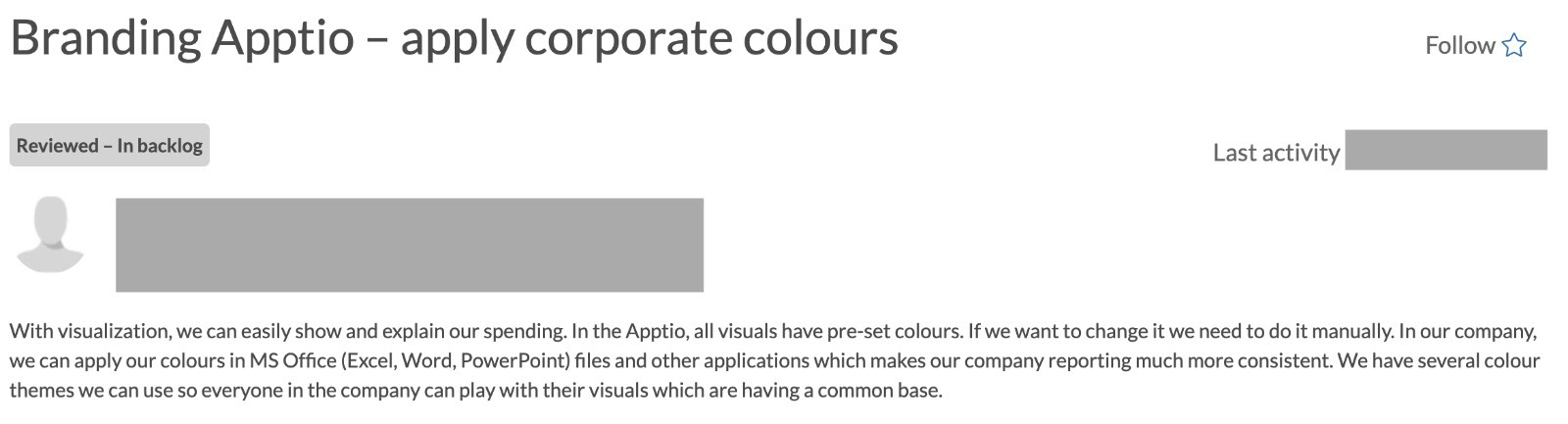
The current design of reports studio provides options to change colours for components, however there is no way to change the colours of an entire report using different colour schemes. Apptio by default provided only one standard theme, which was being used across all reports.
Product team was receiving customer issues on Apptio help-desk, which described this problem with usage of their brand colours too. The clients who came from various domains like banking, finance, marketing wanted an easy way to create custom colour schemes for their reports along with few preset colour schemes which would be useful for all types of users. A contextual research was done with existing clients to gather final requirements of this project.
Customer feedback
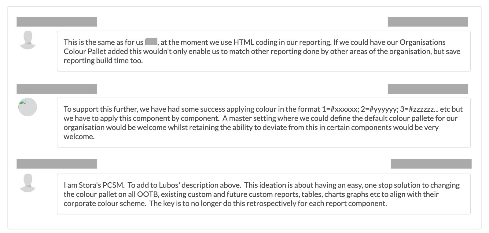
Customer feedback
As this was a long standing issue in Report Studio, a short research was done with selected clients to understand a few basic questions like usage of colour schemes, types of colour schemes, how often the colour scheme would be deleted and how often would it get updated. This was my first project in the company. I needed to understand the product and the present flow for changing colours. I also did a competitive research where similar colour scheme options were provided by other enterprise tools.
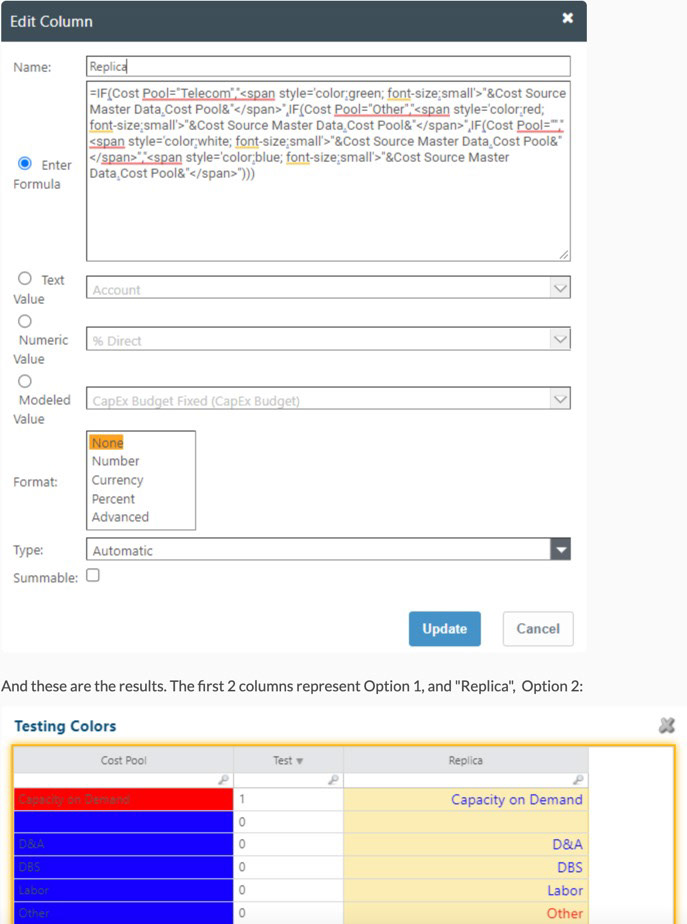
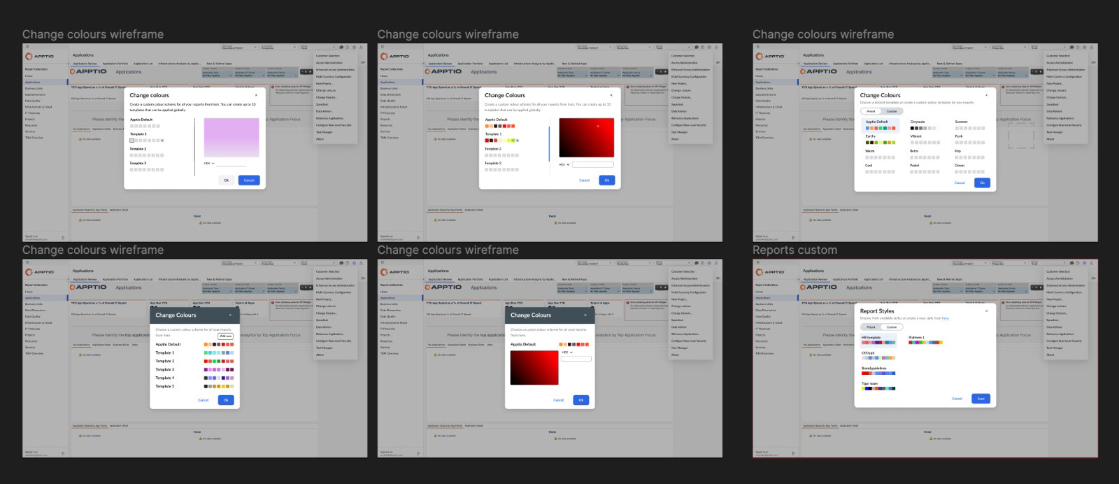
Current feature to change colour of an individual report component
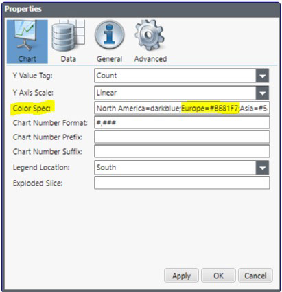
Current feature to change colour of an individual report component
Based on contextual research, following parameters were finalised for the PRD.
• Way to create custom pallets (upto 10)
• 12 colours per custom pallet
• Way to edit created custom pallets
• 10 schemes provided from Reports Studio that do not compromise on accessibility of overall data visualisation
• Deletion not required at the moment
As a design lead for this project, my responsibilities were to create a custom colour scheme flow and to come up with 10 colour themes provided as presets. I spent the next week on ideation and came up with a low fidelity flow that was then validated with the product & engineering team. I also had a peer review session where design team had a chance to review the feature and colour schemes. As my first project with Apptio, the challenge was to not to go against the established design system and to make sure that the feature was technically supported by the old techstack in the product.
Ideation
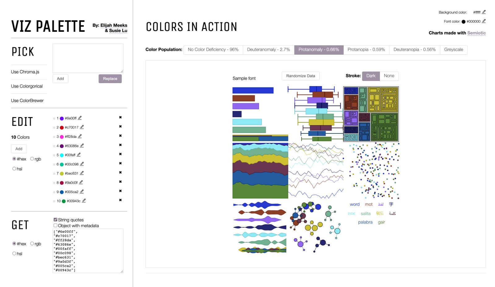
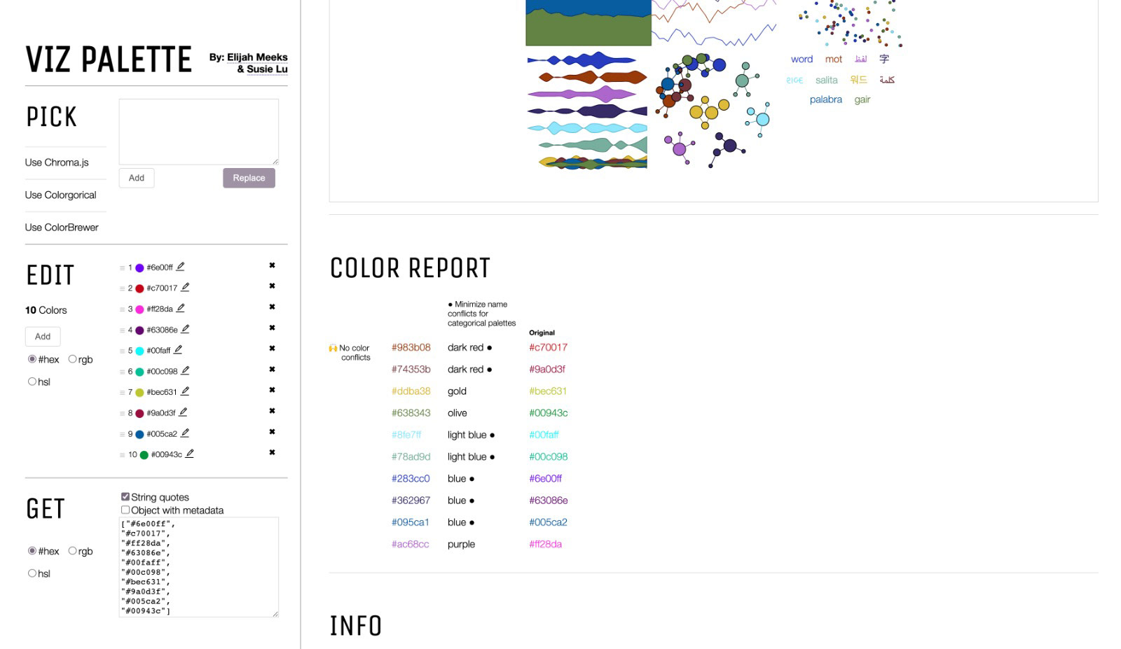
For checking accessibility of proposed pallets I used multiple tools like Stark, Colour Blindness Simulator, and Viz pallets. I also researched on the best practices for data visualisation colours. This gave me following pointers to work with. They also helped with restrictions that were to be kept in mind while choosing colours.
• Consumers have limited attention span. Use of smaller screens & faster scrolling demands for information to be digested quickly & efficiently.
• High contrast plays a significant role in consumption and retention of data points.
• Blue, green, yellow & red are the most effective colours when expressing visual sentiments.
• Vivid colours + high contrast = Peak data retention
• High contrast colours will be easy to differentiate from one another and user will not confuse two data points in a chart.
• Pastel, greyscale and monochrome colour schemes are not easy to identify in vision simulators. Such colour schemes need to be avoided.
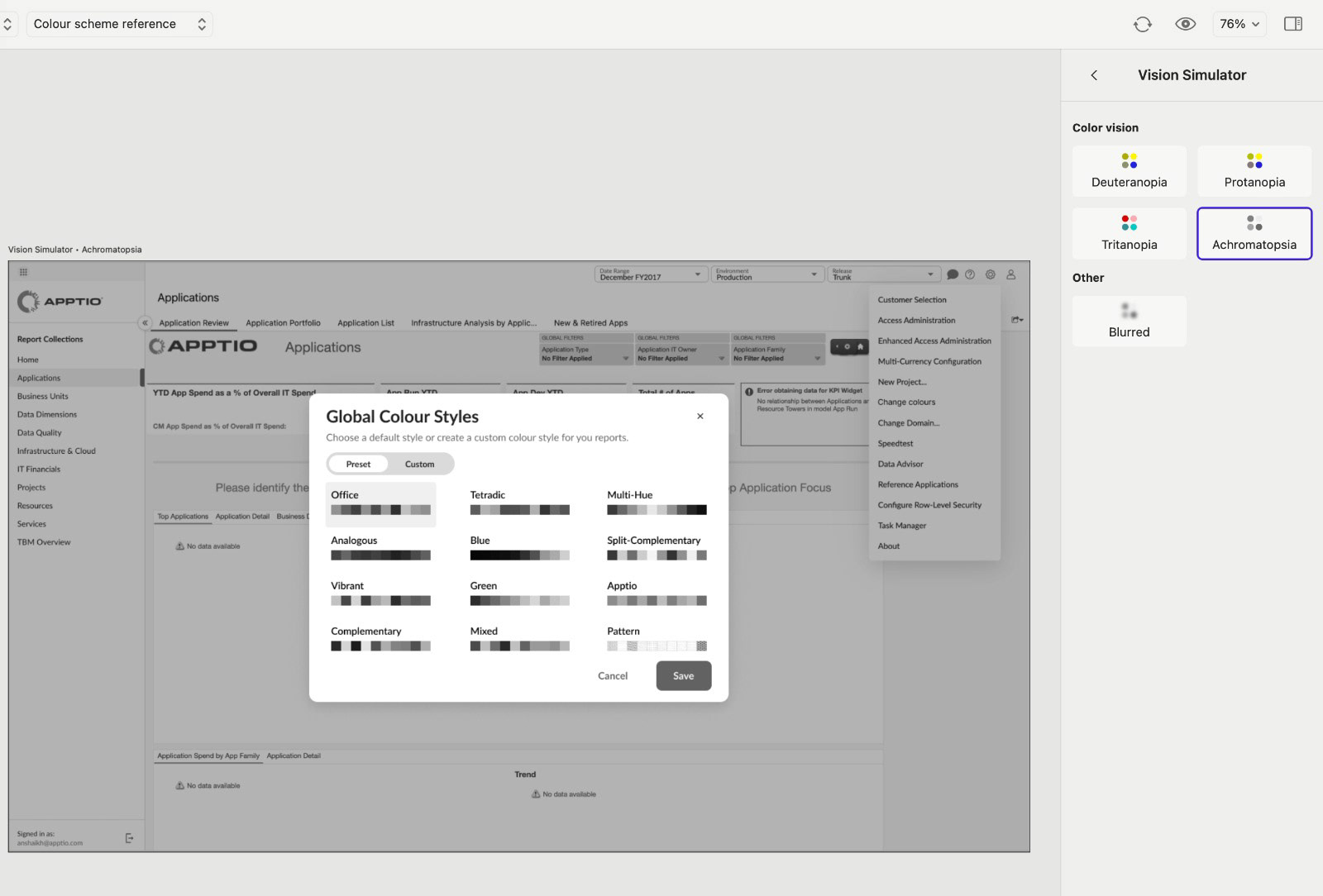
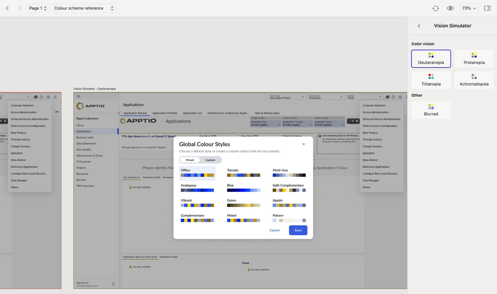
Validating colour schemes for different visions
Validating colour schemes for different visions
Solution
A prototype was created and tested with clients over zoom calls. Minor iterations were done post these feedback sessions. Once the changes were done, a final design was ready to be developed. The feature was being introduced in a legacy product, hence a few micro interactions were kept in backlog for the next version.
Final thoughts
This project was a great way to learn about the product on the job. I worked on this within first month of joining and it helped me understand work processes, design system & tech stack of Apptio One. It also gave me the opportunity to explore more about accessibility in data viz.